Inside the Guide
Introduction
Navigating the world of nursery and school photography pricing can be daunting, especially for those new to volume photography. Whether you’re an established professional photographer or venturing into school and nursery photo packages for the first time, understanding how much to charge is crucial. This guide will help you set competitive and fair prices, ensuring that you cover your costs while meeting market expectations.
Understanding Pricing Factors
Before jumping into specific numbers, it’s essential to understand the various elements that influence school and nursery photography prices:
- Experience and Skill Level: Seasoned photographers generally charge more due to their expertise and reputation.
- Geographical Location: Prices can vary significantly based on the location of the nursery or school.
- Package Inclusions: The number of photos, types of prints, and digital options all affect pricing.
- Market Demand: High demand in your area might allow you to charge more.
- Operational Costs: Equipment, travel, insurance, and other overheads should be considered.
Price Categories
As with everything in life, there are a multitude of different options in pricing for nursery and school photography according to the situation. We’ve broken down the three most important categories for you here.
Photo Sales
This method is highly dependent on making sales. On photo day, you head to the school or nursery and take all your photos, without getting paid in advance for your travel or equipment, for example. Getting revenue from sales afterwards is at your own risk.
Fixed Price
With fixed price sales, you are paid a confirmed fee for your labour. This could be anything, from three hours at a corporate event or half a day at a wedding. Family photoshoots or portrait sessions in the studio are also often settled according to these principles.
Invoice and Photo Sales
Lastly, there is a mixture of the two. In this case you would be paid a small amount in advance to cover your travel and other potential expenses. In addition to that, you can make further profit after the session by selling more pictures.
Prom is a prime example of using this combination. Variations are often used for weddings and studio photography to win over new customers. You need to be careful in these cases that customers do not book a large package in advance, as it could put them off any further sales.

The Five Principles of Photography Pricing
Once you’ve decided on a price category for school or nursery photography, the most important part of the process now begins. Although the appeal and value of your work is of course down to individual taste, you should ask yourself these five questions when setting prices:
1) What Are My Aims?
What do I want to achieve with my product pricing? Maybe you are just beginning your career as a school and nursery photographer and need to establish yourself. In this case, you need prices to help you break even.
Or maybe you have your sights set on so-called ‘competitive pricing’ to set yourself above the rest or gain new customers quickly. You should be careful in this, however; your competitive prices shouldn’t last for a long period of time.
2) Is There Strong Demand for My Pictures?
It’s only logical – to sell profitable photos, there must be a general interest in your services. When you’re focusing on a specific photography niche, you must first always check that your products are actually needed. Perhaps you have actually uncovered a crucial gap in the market and can even raise your prices!
As a rule, school and nursery photography is often in demand. But this can of course depend on regional differences as well. When there are already many photographers working in your area, you should at first keep your prices low to establish yourself.
To make sure your brand is unique and valuable to the market, developing your own personal style is vital. Check out some of our top tips for establishing your own photography style.
3) How High Are My Costs?
The lower boundary for your prices is always decided by the hidden costs. Otherwise, no school or nursery photography business can survive for long. You must not only pay attention to fixed costs, but also variable ones.
Fixed costs could include the rent for your studio and office, equipment, insurance and retirement plans. Taxes are naturally also a big expense to consider. With a few tips and tricks, self-employed photographers can save themselves some money already. Small Business Taxes for Dummies takes a light-hearted and clear look at taxes and offers some handy tips specialised for small businesses.
Variable costs include, as the name might suggest, all costs that can vary from time to time. For example, in nursery and school photography, travel costs are a common variable cost. In addition, compensation for your labour, such as during preparation, shooting, and post-production, can also come under this heading.

4) What Do My Fellow Photographers Earn?
Before you decide on your prices, it is always a good idea to take a look at what else is going on in school and nursery photography. Get an impression of the offers of your competition. A bit of easy internet and social media research can be extremely helpful. You can also find more information at industry-specific trade fairs, like SPAC, SYNC, or TPS. Sometimes you can even find out a lot about competitors just from speaking to your own customers.
5) How Do I Calculate My Prices?
Only after the general factors have been considered can you calculate the exact price. Here are three different techniques to help you out:
- Cost orientation: The easiest approach. The previously calculated costs are simply added to industry-standard mockups. However, there isn’t much room for the perspective of the customer here. This can mean that prices don’t quite match expectations or demand.
- Competitor orientation: With this method, you use the prices of fellow nursery and school photographers as a yardstick. Prices can be set either the same, higher, or lower. What you decide depends on whether you want to establish yourself in a new market or create an image of quality through higher prices. This method is relatively easy to use; however, it can mean you focus too much on other people’s costs, rather than your own.
- Customer orientation: Here, you would try to make sure that the customer gets the best possible prices. The prices should then reflect the value of the products for the customers. To find out this value you might need to undertake time-consuming surveys and tests, but the end result is more than worth it.
All of these techniques have their own advantages and disadvantages. You should base your decision on your own personal preferences and requirements for school and nursery photography.
How Much Do Photographers Charge for Nursery Photos?

When it comes to nursery photography, pricing needs to reflect the value of capturing early childhood moments while being accessible to parents.
Average Nursery Photography Package Prices
Basic
£15 – £30
1-2 Prints
Standard
£30 – £60
Combination of prints and digital files
Premium
£60 – £100+
Multiple prints, a variety of sizes, digital downloads, and/or a small photo book
- Offer Packages in Tiers: Provide basic, standard, and premium options to cater to different budgets.
- Include Digital Options: Parents increasingly prefer digital files alongside traditional prints.
- Run Promotions: Seasonal discounts or introductory offers can attract more clients.
Pricing for School Photos

School photography often involves dealing with larger volumes and a diverse range of orders, from individual portraits to class photos.
Average School Photo Prices
Individual Portraits
£10 – £25 per print
Class Photos
£10 – £20
Composite School Packages
£35 – £75
(including both individual and group photos)
Tips for Setting School Photography Prices
- Understand the Market: Research what other photographers in your area are charging to stay competitive.
- Offer Customisation: Allow parents to choose from various backgrounds and formats.
- Volume Discounts: Schools might appreciate bulk order discounts, especially for class photos.
Crafting Competitive Packages
To stand out, your photography packages need to offer value and flexibility. Here are some ideas:
Classic Package
2 Prints with Mount 5″ x 4″
1 Print with Mount 7″ x 5″
1 Print with Mount 8″ x 6″
Two Small Keyrings – £3.60
Magnet Set of Two – £3.60
£29.90
Super Package
2 Sets of 4 Prints 3.5″ x 2.5″ on a 5″ x 7″
3 Prints with Mount 5″ x 4″
2 Prints with Mount 7″ x 5″
1 Prints with Mount 8″ x 6″
1 Photo Download (original size)
£64.90
Premium Package
3 Sets of 4 Prints 3.5″ x 2.5″ on a 5″ x 7″
6 Prints with Mount 5″ x 4″
4 Prints with Mount 7″ x 5″
2 Prints with Mount 8″ x 6″
1 Print with Mount 10″ x 8″
3 Photo Downloads (original size)
£99.90
Additional Considerations: Upselling and Add-Ons
When pricing your services, consider offering add-ons and upselling opportunities:
- Framed Prints: Offer to frame photos for an additional fee.
- Photo Gifts: Keychains, mugs, and other personalised items can be popular.
- Retouching Services: Offer basic retouching for an added cost.
Conclusion
Setting the right prices for nursery and school photography requires a balance between covering your costs, staying competitive, and offering value to your clients. By understanding market standards and effectively communicating the benefits of your packages, you can attract more clients and build a successful photography business.
If you’re looking to refine your pricing strategy or need more personalised advice, don’t hesitate to reach out to our team at GotPhoto. We’re here to help you succeed.
Ready to take your school and nursery photography to the next level? Contact us today for a consultation and start crafting the perfect packages for your clients!
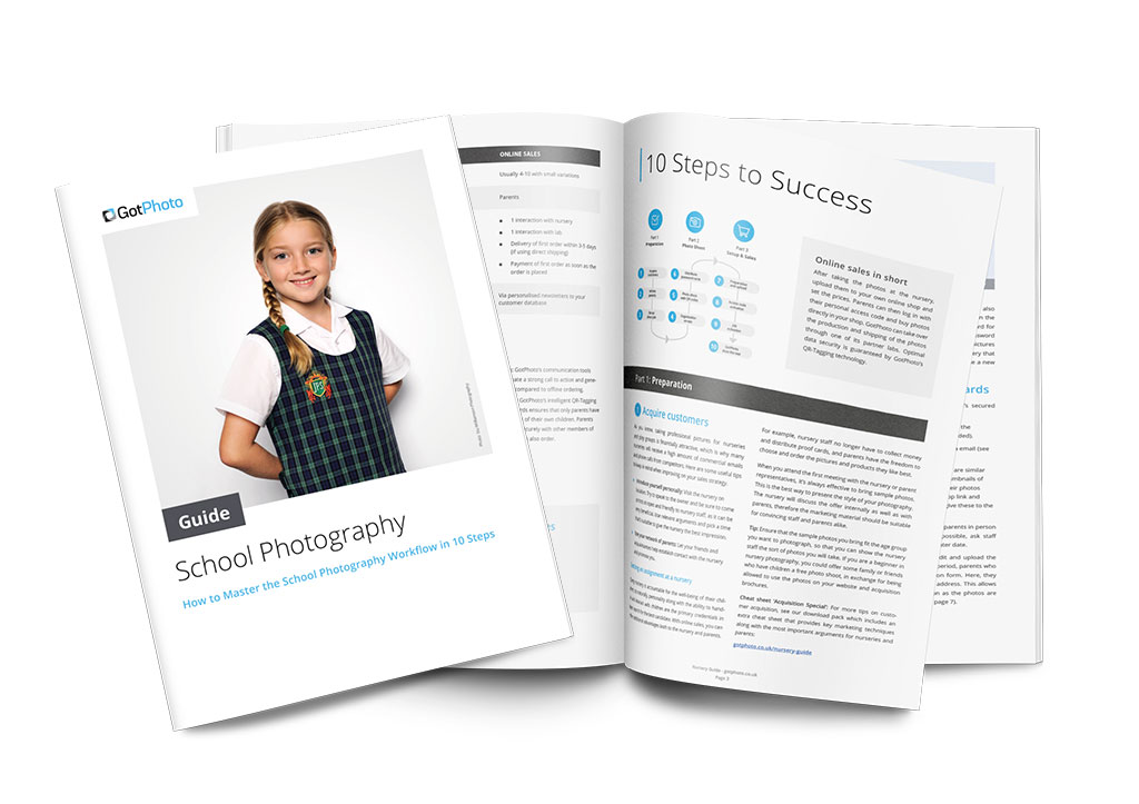
Get the Free School Photography Guide

For more school photography tips, download our free guide!

